Wednesday, 22 February 2012

Magazine Mock-ups

Magazine Mock-ups


These are the mock-ups of my magazines front cover contents page and also double page spread.

Tuesday, 21 February 2012

Magazine Analysis

Magazine Analysis 


For this part of my coursework I will be analysing a front cover of a music magazine that is similar to the genre of magazine that I will be creating. I will be using appropriate media terminology to analyse the magazine. The magazine front cover that I am going to be analysing will be the Kerrang music magazine. I will analyse the Puffs, Pugs and other features of the front cover.


First of all is the Masthead that is used on the Kerrang front cover. It is very big and bold and can be seen very clearly from a quick glance. This is good as it draws the attention to the magazine and will help to entice people into buying it. The Masthead used with the Kerrang is consistent throughout all of the Kerrang magazines, this also helps with the house-style which we will talk about later. The font is always the same and always has a smashed effect on it to reaffirm the ideology of Kerrang that it is breaking the stereotype of other more mainstream magazines.There is a small strap-line above the Masthead outlining some of the other features that are included in the magazine. Next we will talk about the house-style of the Kerrang. The house-style is very dark and grungy which is sticking to the stereotype of not conforming to the mainstream, this Masthead used within Kerrang magazines is always the same giving it a very unique house-style that can be instantly recognised. from anywhere. The Cover shot featured on the Kerrang magazine is of one of the Slipknot members, the way in which the photo is portrayed makes the magazine once again stick to its promise of not conforming to the mainstream stereotype as it is a very menacing picture with most of his face cloaked in shadow. The Main Heading of the Kerrang magazine is plainly just the word Slipknot as they are then main feature of the magazine, but this text is in the font of the bands logo giving it instant recognition to people who may know the band, but it also has some anchorage text saying "Somebodys Gonna Get Killed..." once again giving a more sinister approach that other mainstream magazines may not use. The bar-code is situated on the bottom right of the magazine out of the way of the main content. There are also small pieces f text above the bar-code showing some other features of the magazine other than the main story about slipknot.There is a small banner at the bottom of the magazine promoting some of the incentives that Kerrang is offering the purchasers of the magazine such as Free Posters.

Friday, 10 February 2012

Preliminary Task

Preliminary Task

This is the work that I have created for my preliminary task. I have created a newsletter front page and a flat plan of the newsletters front page.


I have also created a box mockup of the contents page of this school newletter.

Preliminary Task Work In Progress

Preliminary Task Work In Progress


This is my school newsletter work in progress. I have currently completed the front cover of my school newsletter.

Friday, 3 February 2012

Newsletter Analysis

Newsletter Analysis

The first newsletter that I am going to analyze is the Deyes High School Newsletter. Firstly we can consider the layout of the deyes high newsletter, straight away we can see that deyes high newsletter is layed out in a very smart and formal way with everything being uniform and neat. This gives the impression that the newsletter is intended to be viewed more by the parents of the students rather than the student themselves and is indeed more formal to read. The colours used within the deyes high school newsletter are non-existent, this makes the newsletter once again look more formal hence giving the impression that it was intended to be read to inform rather than entertain. The deyes high newsletter also uses a picture of the Lydiate building on the front of the newsletter, this ivy covered building gives the image of a very traditional school with a traditional education system. Lastly the use of Comic Sans font on the deyes high newsletter goes away from the formal feeling of the newsletter as it is commonly associated with being a childish font to use.


The second newsletter that I am going to be analysing is the ST Ambrose Barlow School newsletter. Firstly we can consider the layout of the Ambrose Barlow School newsletter, we can immediately see that the latout is a lot less sophisticated when compared to the Deyes High School newsletter straight away telling us that this newsletter may be more suited for the pupils to read more than the parents or adults in school. The colours used within the Ambrose Barlow are done in such a way as to not be over the top but are done to give the newsletter a more striking appearance which will grab the student attention to the magazine.

Wednesday, 1 February 2012

Cohen's Moral Panic

Cohen's Moral Panic

'Moral Panic' is when a condition which is a group of people, or a single person is portrayed as a threat within the media. This can be done do promote some change within that person or industry in which they are within.


There are five features of Moral Panic:


  • Concern – There must be awareness that the behaviour of the group or category in question is likely to have a negative impact on society.
  • Hostility – Hostility towards the group in question increases, and they become "folk devils". A clear division forms between "them" and "us".
  • Consensus – Though concern does not have to be nationwide, there must be widespread acceptance that the group in question poses a very real threat to society. It is important at this stage that the "moral entrepreneurs" are vocal and the "folk devils" appear weak and disorganised.
  • Disproportionality – The action taken is disproportionate to the actual threat posed by the accused group.
  • Volatility – Moral panics are highly volatile and tend to disappear as quickly as they appeared due to a wane in public interest or news reports changing to another topic.

Examples of Moral Panic


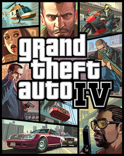
These are two examples of games which caused moral panic throughout the media with their launch.The media made these games look worse than they are.

Music Magazines

Moral Panic can be used within music magazines. Since we are creating magazines for a Teenage audience moral panic can be used as they will be drawn to a magazine with a bit an edge to the content.

Friday, 27 January 2012

Ideology

Ideology

Ideology is one of the most important key concept as it underpins the construction of any media text.The idea of ideology in media is mainly built on a system of beliefs that is constructed and then presented by many forms of media. An example of this would be with different newspapers, Such as The Times may regard their audience as more sophisticated readers whereas readers of The Mirror may be regarded as less sophisticated and more fun loving.

This would be very important within a magazine as this would setup the main demographic for your magazine. This could be because if your ideology is more suited towards a specific demographic they will be the main audience of your magazine. Kerrang's ideology is to oppose the mainstream, this can be seen with their mission statement 'Break the mould', so you would not expect the readers of NME to also be reading Kerrang as their ideologies clash.

Ideology of School Newsletter

The ideology shown here from the schools newsletter is that the school is full of fun activities that children can get involved in, t also makes the school look very positive with the images of the children working and talking together.