Here are two magazine covers that I have created mock-ups of.


The Kerrang Magzaine has a very distinctive layout. Kerrang Magazine have the same Masthead on each of their magazines, this makes them instantly recognisable to people who may be looking to buy the magazine. Kerrang also have a slightly less pristine layout compared to other magazines, but this is all done to fit in with the genre of music that the magazine chooses to create its content on and fits in with the demographic of the magazine.
The main image of the Kerrang Magazine also shows alot about the magazine, this is mainly because the main image covers the Title of the Kerrang magazines, this shows that the Kerrang magzaine must be pretty much insatantly recognisable by its house style as people do not need to see its title. This also makes Corey Taylor look more important than the magazine itself.
There are many pugs used within the front cover of the Kerrang magainze, these have been used mainly to attract the attention of the potential buyers of kerrang as they are very eye catching.They are also being used to promote some of the other content that is within the magazine apart from the main content within the magazine.

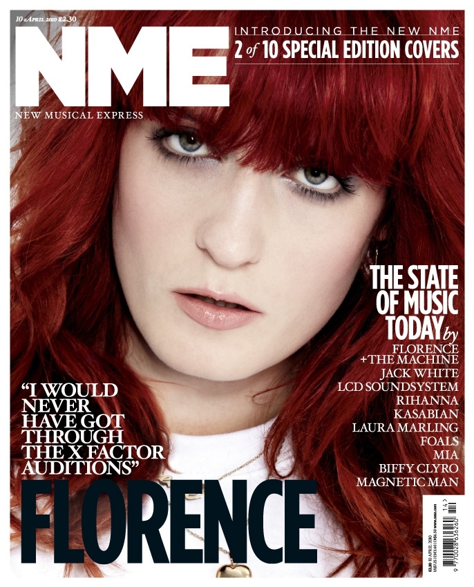
The NME Music magazine on the other hand has a completely different layout when compared to Kerrang. NME goes for a more minimalistic look for its layout and colour scheme, this is also representative of the genre of music that NME creates it's content for and also once again of the demographic of the NME magazine.
No comments:
Post a Comment