Friday 27 April 2012

Evaluation of Double Page Spread

Evaluation of Double Page Spread

This is a good example of a double page spread from Kerrang Magazine. There are many reasons why it is good such as the Main heading for the article is very eye catching and bold, this is good as it instantaniously grabs the users attention drawing them to read the whole article if they were just flicking through the magzine quickly. Another good feature is the use of the image on the right of the double page, this is good as once again is instantly grabs the users attention as the image sticks out, it is also good as it relates to the content helping fans of the band to relate more to the content being written. The colours used in the double page are also good as they are all the same, the colours used are white black and red which once again stick to kerrangs own house style.
 
This is another good example of the double page spread. One of the reasons why it is good is the use of images throught the article, this is good as it gives the reader something so relate the content to giving them the chance to see what the content in the article is about. They are also very eye cathing and help to draw the attention of the user. The layout of the magzine double page spread is also very good, the pictures are all framed around the page with the text all on the left hand side of the page, this makes the double page look a lot more professional and more attractive to the reader. The colours used are also very good as the article uses the colours white, black and red once again sticking to Kerrangs own house style.

Evaluation of Kerrang Contents

Evaluation of Kerrang Contents Page:

This contents page is a very good example of a professional looking magazine contents page. It is also good for many reasons, such as the layout of the Kerrang Contents page is very well done. It allows the user to read all of the content very easily as it is all framed so that each bit of content is distinguishable from other content. The Fonts used within the contents page are also very good as the titles used for each part of the magazine are very bold drawing the attention of the user and also once again they are very distinguishable meaning that the reader can quickly find the part of the magzine that they would like to read. The colour scheme used sticks to the simple yet striking colours used throughout the magazine, the Yellow text on the black background once again helps to draw the attention of the reader. Another good feature of this contents page is the use of Photos, this is good as it gives the reader something that is related to the content to look at while reading the page.

This is another good example of a contents page. There are a number of reasons why this is a good contents page such as, The use of images used within the contents page is good. This is a good feature as it allows the reader to see what the content is about before reading it, also it grabs the readers attention drawing them to the most important content in the magazine such as the exclusive interviews. Another good feature is the use of eye catching fonts. This is good as it draws the readers attention to the different sections of the magazine and helps to distinguish the different parts of the magzine from the others.  The use of colours is also a good feature as the yellow text on the black background helps to draw attention to the different parts of the magazine and also helps to distinguish different parts of the magazine helping the user to find the part of the magzine they want to read. The colours used also stick to kerrangs colours scheme of white, black yellow and some red. This is good as readers will directly associate this with kerrang. Lastly there is a good use of an advert used as the bottom right of the contents page, this is good as it is helping to promote the magaize through the use of an offer on the magazine, helping to entice the reader to buy the magazine more.

Thursday 26 April 2012

Monday 23 April 2012

Photoshop Picture

I have just finished photo-shopping another picture for use within my magazine. I have made the photo black and white, cleared the floor of debris and also added a colour splash effect to the sign in the middle.


Prezi Evaluation


Friday 16 March 2012

Magazine Front Cover WIP

Magazine Front Cover WIP
This is the magazine front cover I have as of now, I still have to change the fonts used on the Mast head and clean up other areas.

Wednesday 14 March 2012

Summary Of Charity Poster

Summary Of Charity Poster
From the experimentation of Luke's Charity Post we have done today I would use the skills I have practised today within my music magazine. Because of this I have decided that the next thing that I will be doing with my music magazine is to manipulate the images within my magazine using photoshop.I will be editing the contrast and levels within photos to make the images look more professional.
Luke's Charity Haircut

Luke's Charity Haircut
This is the poster I have created within the lesson to help promote Luke's Charity Haircut.

Friday 9 March 2012

Magazine WIP

Magazine WIP
This is a screenshot of the magazine that I am creating. This is a work in progress and is not completed yet.

Friday 2 March 2012

Costume

Costume
For my magazine am going to have to research the costumes that the people within my photo shoot are going to be wearing. This will be all of the clothing and props used within the photo shoot such as guitars or other musical instruments. Many bands have long hair in a rugged unkempt style giving the rebel style that is most commonly associated with this genre of music. Some bands also opt for face paint to further press the threatening look. The style of clothing that most of the bands wear is the same, this is mainly baggy ripped clothes that are usually black or some other dark colours, this can include baggy hoodies, ripped shirts and ripped denim jackets. They also mostly wear black or dark coloured baggy jeans or dark coloured combat pants. The shoes worn by most of the people associated with the genre are either boots or skate shoes. Many of the bands have many accessories, these can include spiked gauntlets, bullet belts and sometimes chains.

For my photo shoot I am going to try and create an image using these distinctive features of the genre, this will help me to create a more believable magazine to my particular music genre. Here are some examples of people in this costume style:

Immortal

Thursday 1 March 2012

Magazine Moodboard

Magazine Mood board
This is the mood board that I have created for my magazine. It gives examples of band shots, colours and fonts used within the genre of music that I am creating my magazine on. It shows that many of the colours used within this genre of music are mostly dark colours, such as black and dark red. The styles used are mostly minimalistic when looking at album artwork and also the band pictures. The fonts used on the mood board are all very distorted and are all in capital giving it a very striking and eye-catching image. Most fonts also use a straight sharp edged stylised fonts, but some also decide to use more rounded olden styled fonts creating a less in your face image than some other fonts.


Tuesday 28 February 2012

Magazine Article Review

Magazine Article Review
The language used within the article has a very particular style of writing. First of all the article is very informative, showing that the reviewer has first of all listened to the music that is being reviewed so that they can give an honest review of the music. The language also interacts with the user with the use of personal pronouns, this gives the review reader a sense that they are being spoken to personally. This is good as it makes the review feel more personal and down to earth as if the reviewer was just the same as them. Many reviews also use scores, this is good as it gives the viewer a quicker reference to how good the music being reviewed is before the full article has began. Most of the language used is largely informal yet informative at the same time, this gives all of the information that is needed for the readers to know as well as keeping the language going formal which would not suit the laid back style of the magazine.

Friday 24 February 2012

Music Genre Post

Music Genre

The Genre of my music will be a rock/metal magazine. This is mainly because this is the music that interests me and I will be able to relate to this genre which will help me in creating it. Since both rock and metal are very diverse genres of music there are many different influences on both of them. Because of this my magazine will not be as formally set out as other magazines such as Q or NME and will feature a more chaotic layout with more chaotic colour schemes as well. I will also be featuring band that will be faithful to the genre and also promote features that people interested in this genre will approve of.

Photoshoot Plan

Photoshoot Plan

Over the weekend I will be producing the photos that I will be using within the music magazine that I will be producing. I will be considering the genre of the magazine when planning the phots that I will be taking this is becuase I do not want to take photos that would not suit the genre of the magazine.

The majority of the photos that I am going to be taking will be done outdoors in a more gritty area. This is to stick with the grungy metal genre that my magazine will be appealing to. I will be using props such as an electric guitar, a mixing desk and computer and a keyboard. The clothing used within the photos will also be more of a gritty style to stay true to the magazines genre.

I will be taking around 10-20 picture in my photoshoot, this is to make sure that I have a satisfactory amount of pictures to choose from and also that I can get all of the shots to look as good as I need them. I will not be using all of these photos only some of them and will be editing them within Adobe Photoshop.

Wednesday 22 February 2012

Magazine Mock-ups

Magazine Mock-ups


These are the mock-ups of my magazines front cover contents page and also double page spread.

Tuesday 21 February 2012

Magazine Analysis

Magazine Analysis 


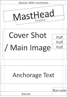
For this part of my coursework I will be analysing a front cover of a music magazine that is similar to the genre of magazine that I will be creating. I will be using appropriate media terminology to analyse the magazine. The magazine front cover that I am going to be analysing will be the Kerrang music magazine. I will analyse the Puffs, Pugs and other features of the front cover.


First of all is the Masthead that is used on the Kerrang front cover. It is very big and bold and can be seen very clearly from a quick glance. This is good as it draws the attention to the magazine and will help to entice people into buying it. The Masthead used with the Kerrang is consistent throughout all of the Kerrang magazines, this also helps with the house-style which we will talk about later. The font is always the same and always has a smashed effect on it to reaffirm the ideology of Kerrang that it is breaking the stereotype of other more mainstream magazines.There is a small strap-line above the Masthead outlining some of the other features that are included in the magazine. Next we will talk about the house-style of the Kerrang. The house-style is very dark and grungy which is sticking to the stereotype of not conforming to the mainstream, this Masthead used within Kerrang magazines is always the same giving it a very unique house-style that can be instantly recognised. from anywhere. The Cover shot featured on the Kerrang magazine is of one of the Slipknot members, the way in which the photo is portrayed makes the magazine once again stick to its promise of not conforming to the mainstream stereotype as it is a very menacing picture with most of his face cloaked in shadow. The Main Heading of the Kerrang magazine is plainly just the word Slipknot as they are then main feature of the magazine, but this text is in the font of the bands logo giving it instant recognition to people who may know the band, but it also has some anchorage text saying "Somebodys Gonna Get Killed..." once again giving a more sinister approach that other mainstream magazines may not use. The bar-code is situated on the bottom right of the magazine out of the way of the main content. There are also small pieces f text above the bar-code showing some other features of the magazine other than the main story about slipknot.There is a small banner at the bottom of the magazine promoting some of the incentives that Kerrang is offering the purchasers of the magazine such as Free Posters.

Friday 10 February 2012

Preliminary Task

Preliminary Task

This is the work that I have created for my preliminary task. I have created a newsletter front page and a flat plan of the newsletters front page.


I have also created a box mockup of the contents page of this school newletter.

Preliminary Task Work In Progress

Preliminary Task Work In Progress


This is my school newsletter work in progress. I have currently completed the front cover of my school newsletter.

Friday 3 February 2012

Newsletter Analysis

Newsletter Analysis

The first newsletter that I am going to analyze is the Deyes High School Newsletter. Firstly we can consider the layout of the deyes high newsletter, straight away we can see that deyes high newsletter is layed out in a very smart and formal way with everything being uniform and neat. This gives the impression that the newsletter is intended to be viewed more by the parents of the students rather than the student themselves and is indeed more formal to read. The colours used within the deyes high school newsletter are non-existent, this makes the newsletter once again look more formal hence giving the impression that it was intended to be read to inform rather than entertain. The deyes high newsletter also uses a picture of the Lydiate building on the front of the newsletter, this ivy covered building gives the image of a very traditional school with a traditional education system. Lastly the use of Comic Sans font on the deyes high newsletter goes away from the formal feeling of the newsletter as it is commonly associated with being a childish font to use.


The second newsletter that I am going to be analysing is the ST Ambrose Barlow School newsletter. Firstly we can consider the layout of the Ambrose Barlow School newsletter, we can immediately see that the latout is a lot less sophisticated when compared to the Deyes High School newsletter straight away telling us that this newsletter may be more suited for the pupils to read more than the parents or adults in school. The colours used within the Ambrose Barlow are done in such a way as to not be over the top but are done to give the newsletter a more striking appearance which will grab the student attention to the magazine.

Wednesday 1 February 2012

Cohen's Moral Panic

Cohen's Moral Panic

'Moral Panic' is when a condition which is a group of people, or a single person is portrayed as a threat within the media. This can be done do promote some change within that person or industry in which they are within.


There are five features of Moral Panic:


  • Concern – There must be awareness that the behaviour of the group or category in question is likely to have a negative impact on society.
  • Hostility – Hostility towards the group in question increases, and they become "folk devils". A clear division forms between "them" and "us".
  • Consensus – Though concern does not have to be nationwide, there must be widespread acceptance that the group in question poses a very real threat to society. It is important at this stage that the "moral entrepreneurs" are vocal and the "folk devils" appear weak and disorganised.
  • Disproportionality – The action taken is disproportionate to the actual threat posed by the accused group.
  • Volatility – Moral panics are highly volatile and tend to disappear as quickly as they appeared due to a wane in public interest or news reports changing to another topic.

Examples of Moral Panic


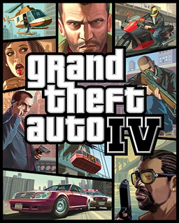
These are two examples of games which caused moral panic throughout the media with their launch.The media made these games look worse than they are.

Music Magazines

Moral Panic can be used within music magazines. Since we are creating magazines for a Teenage audience moral panic can be used as they will be drawn to a magazine with a bit an edge to the content.

Friday 27 January 2012

Ideology

Ideology

Ideology is one of the most important key concept as it underpins the construction of any media text.The idea of ideology in media is mainly built on a system of beliefs that is constructed and then presented by many forms of media. An example of this would be with different newspapers, Such as The Times may regard their audience as more sophisticated readers whereas readers of The Mirror may be regarded as less sophisticated and more fun loving.

This would be very important within a magazine as this would setup the main demographic for your magazine. This could be because if your ideology is more suited towards a specific demographic they will be the main audience of your magazine. Kerrang's ideology is to oppose the mainstream, this can be seen with their mission statement 'Break the mould', so you would not expect the readers of NME to also be reading Kerrang as their ideologies clash.

Ideology of School Newsletter

The ideology shown here from the schools newsletter is that the school is full of fun activities that children can get involved in, t also makes the school look very positive with the images of the children working and talking together.

Thursday 26 January 2012

Front Cover Box Mock-Ups

Front Cover Box Mock-Ups

Here are two magazine covers that I have created mock-ups of.


The Kerrang Magzaine has a very distinctive layout. Kerrang Magazine have the same Masthead on each of their magazines, this makes them instantly recognisable to people who may be looking to buy the magazine. Kerrang also have a slightly less pristine layout compared to other magazines, but this is all done to fit in with the genre of music that the magazine chooses to create its content on and fits in with the demographic of the magazine.

The main image of the Kerrang Magazine also shows alot about the magazine, this is mainly because the main image covers the Title of the Kerrang magazines, this shows that the Kerrang magzaine must be pretty much insatantly recognisable by its house style as people do not need to see its title. This also makes Corey Taylor look more important than the magazine itself.

There are many pugs used within the front cover of the Kerrang magainze, these have been used mainly to attract the attention of the potential buyers of kerrang as they are very eye catching.They are also being used to promote some of the other content that is within the magazine apart from the main content within the magazine.


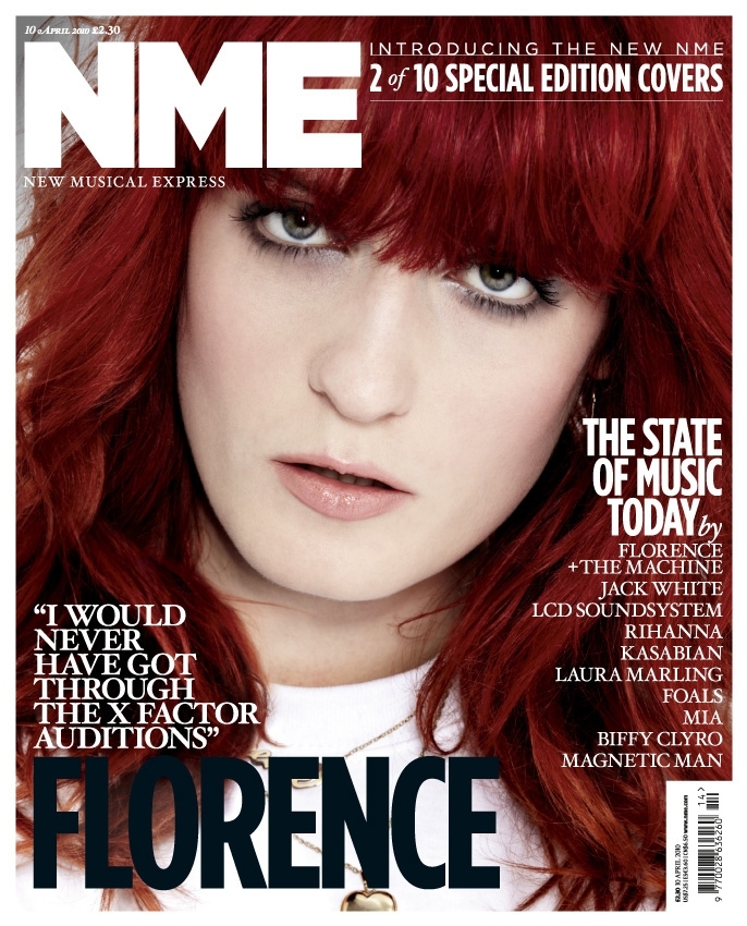
The NME Music magazine on the other hand has a completely different layout when compared to Kerrang. NME goes for a more minimalistic look for its layout and colour scheme, this is also representative of the genre of music that NME creates it's content for and also once again of the demographic of the NME magazine.

Rule Of Thirds Example Photo

Rule Of Thirds Example

This is the Photo I have taken for my Rule Of Thirds Example. As you can see the Van is taking up roughly Two thirds of the photo and would be lying on one of the intersections of the Rule of Thirds Grid.


Wednesday 25 January 2012

Rule of Thirds

Rule of Thirds

The Rule of Thirds (Sometimes called the Rule of Thumb) is a guideline which can be applied to photographs and paintings. The photograph should be spilt into 9 equal parts which should be used as guidelines for positioning objects within the photo. It is proposed that the main focal point should not be centre of the picture, it should be placed on one of the intersections of the grid. (See below for example). This makes the photo look more natural and appealing to the viewer.


Tuesday 24 January 2012

The Male Gaze Theory.

The Male Gaze Theory

The Male Gaze Theory was first introduced by Laura Mulvey. It suggests cinema audiences look at films in two different ways, Voyeuristically and Fetishistically. This is because films are watched by audiences without the audience being watched themselves, it is also usually in a darkened room where it is hard to view other films viewers. This in effect makes them almost voyeurs which inadvertently will cause two things to happen:

  • Objectification of characters
  • Narcissistic identification with ideal image in the films
As stated above it is also suggested that characters may into objects, in a way which makes the characters more objectified and desirable to the audience. This has led to iconic female actors who is celebrated more for her looks than she is for her talent. This is just seen as more 'Eye Candy' for male audiences.

I will now give a brief overview of some films in which the Male Gaze theory can be easily applied.

1. Into The Blue

Into The Blue is a good example of where the Male Gaze Theory can be applied easily. This is because of the way in which Jessica Alba's character is portrayed in the film. As you can see in the poster to the right, Jessica Alba is dressed in a bikini which makes her easy 'eye candy' for the male audience. But also the males in the films are also shown to be strong and handsome making them an ideal image for males to want to follow.
2. Transformers

Transformers is another easy film to apply the Male Gaze Theory onto. This is because from the very start of the film Megan Fox is shown to have no big part to play as she is only a helper, yet she is in many scenes and is shown mainly to be once again 'Eye Candy' for the male audience.


3. James Bond: Casino Royale

James Bond is one of the biggest films that the Male Gaze theory can be easily applied to. This is mainly because it is the epitome the man that males want to be. Bond is shown to get all the girls and also take down all the enemies without breaking a stretch which is what other males idolise about him. Also many of the women in bond films a shown to be objects rather than actually people making the females once again 'eye candy' for the male audience.


4. Mission Impossible 4

Mission Impossible 4 is another good film on which the Male Gaze Theory can be applied. This is ponce again due to the fact that the main character is easy for males to idolise for his talents. Also many of the leading females are shown to be eye candy to the male audience but yet they also play some pivotal roles within the mission impossible films lowering the effect of them being objectified.


5. Sucker Punch

Sucker Punch is another film in which the Male Gaze Theory can be applied. This is mainly due to the all female cast making them the main focus of the film, which is of course appealing to the male audience. But the female cast is shown to be less objectified for doing this. This is because none of the cast are perceived as eye candy as all of them serve a main role within the film.

School Newsletter Evaluation

School Newsletter Evaluation
In this post I will be evaluating the front cover and the double page spread of the school newsletter.

Front Cover
This front cover portrays many of the characteristics that we would expect to be on the front of a schools newsletter. Firstly the schools logo is placed at the top and is the largest thing on the page, the other pictures are also scenes from within the school environment. The colours used on the front page also fit in with the colours of the School Logo (Blue,White And Red) this is the house style for the newsletter.

Double Page Spread.
The double page spread also used some of the characteristics that are expected within school newsletters. Firstly the language used throughout the pages in formal, this is because the newsletter has been made primarily to inform students then to entertain. The house style is also rather similar with the white background and the blue text for the headings. The layout it also set-up as columns which is also very formal which is to be expected from a school newsletter.

Prelimminary School Magazine Work

School Magazine


In a school magazine you would expect to see many different things. Firstly in terms of the colours used throughout the newsletter would usually be related to the school in some way,this will probably be the colour of the schools uniform giving a general image to the magazine, this would become the house style of the whole magazine ans would be able to be seen throughout.

Secondly the language used throughout the newsletter could either be formal or informal depending on who is writing the magazine, if the magazine was written by staff for pupils then the language used would be more likely to be formal, whereas if the magazine was written by students for students then it would most likely incorporate less formal language.

There would also be many pictures throughout the magazines depicting scenes throughout school, these would be related to the articles throughout the magnetic, there would also be a picture of the schools logo usually on the front cover of the magazine.

Monday 23 January 2012

Semiotic Theory


Semiotic Theory


Semiotics is the study of signs, sign can be described as something that stands for something other than itself. For example the colour red can be used to show Passion and Anger.


There are really two main theories when it comes to Semiotics, the first belongs to Ferdinand de Saussure with hisDyadic Semiotic System. With this theory there is a Signifier and a Signified, The Signifier is what can been soon or what is there whereas the Signified is what is meant or otherwise portrayed by this.

The next theory comes from a man called Charles Sander Pierce who invented the Triadic Semiotic System.In this theory there are three different elements.
Charles Sander Pierce's
Triadic Semiotic System
  • Index
  • Symbols
  • Icons
Charles Pierce described different types of signs. Indexes are signs that directly link to the meaning. Icons are related to the meaning but only slightly, and Symbols do not link to the represent the meaning in any way.